Nike news
+6
DaTruRochin
NoPoNeighbor
VillaGorilla
PilotNut
DoubleDipper
PurplePrideTrumpet
10 posters
Page 1 of 2
Page 1 of 2 • 1, 2 
 Nike news
http://www.portlandpilots.com/news/2014/9/2/GEN_0902141353.aspx?path=general
The school extended their deal through 2022. They buried the lede though:
If the refresh includes an anchor and/or ship's wheel I'm in.
The school extended their deal through 2022. They buried the lede though:
The Nike design team...is currently working on a brand refresh that will roll out during the 2014-15 school year.
If the refresh includes an anchor and/or ship's wheel I'm in.

PurplePrideTrumpet- All-American

- Number of posts : 2880
Age : 43
Location : Section 18A, Row 5
Registration date : 2007-11-24
 Re: Nike news
Well then, YOU'RE IN, PPT!PurplePrideTrumpet wrote:If the refresh includes an anchor and/or ship's wheel I'm in.
Stylized, but still easily recognizable.

DoubleDipper- Pilot Nation Legend

- Number of posts : 11506
Location : Flying, Golfing, or at the Game
Registration date : 2011-11-03
 Re: Nike news
I hope the agreement includes MORE Nike options in the bookstore and at Merlo/Chiles!
_________________
Run 'Em Aground Pilots!

PilotNut- Administrator

- Number of posts : 4259
Age : 51
Location : The 503
Registration date : 2007-04-28
 Re: Nike news
PilotNut wrote:I hope the agreement includes MORE Nike options in the bookstore and at Merlo/Chiles!
YES.
I hope the "brand refresh" does keep the 'P' they came out with six or seven years ago. It may have gotten flak on this board, but I dig it.

VillaGorilla- Pilot Nation Regular

- Number of posts : 405
Age : 40
Location : Portland, OR
Registration date : 2007-08-09
 Re: Nike news
I like the P, too... but I agree that it could use a little something more added to it. That P superimposed over a wheel or anchor would be nice...
_________________
Run 'Em Aground Pilots!

PilotNut- Administrator

- Number of posts : 4259
Age : 51
Location : The 503
Registration date : 2007-04-28
 Re: Nike news
Agreed, keep the P. I hope this is what they mean by a "refresh" rather than a "redesign."
The P has character. It is distinctive. It looks fresh and stylish, but also classy. Also, I hate when schools/teams change their primary logo every few years.
I hope what they do is keep the P as the primary logo, but add a variation with a wheel incorporated. I don't think an anchor portrays the right message for an athletic department!
NoPoNeighbor- Playmaker

- Number of posts : 1405
Registration date : 2012-02-04
 Re: Nike news
More details on the logo update, via The Beacon:
"As part of the new contract, Nike is doing a brand refresh of UP’s current logo and designing a new secondary logo. In October, UP will present the new logos created by Nike’s graphic identity group at a big reveal, according to Jason Brough, associate athletic director. The details of the logos will be kept secret until the reveal, Brough said, but the “P” logo will be refreshed with some minor adjustments."
So, we won't have to wait long. New logos revealed next month.
NoPoNeighbor- Playmaker

- Number of posts : 1405
Registration date : 2012-02-04
 Re: Nike news
I found the new logo:


NoPoNeighbor- Playmaker

- Number of posts : 1405
Registration date : 2012-02-04
 Re: Nike news
I don't hate it... it will be interesting to see it without the strings in the way. I do like having a return to the nautical theme--which helps differentiate us! It is already growing on me...
Looking at some of the updated fonts in recent emails, etc., you can notice some subtle differences. I think they are positive:

Notice that some of the negative space has been filled in, particularly between the T and L of Portland and I and L of Pilots.
Looking at some of the updated fonts in recent emails, etc., you can notice some subtle differences. I think they are positive:

Notice that some of the negative space has been filled in, particularly between the T and L of Portland and I and L of Pilots.
_________________
Run 'Em Aground Pilots!

PilotNut- Administrator

- Number of posts : 4259
Age : 51
Location : The 503
Registration date : 2007-04-28
 Re: Nike news
First thoughts on the logo: I don't understand why the wheel isn't complete. Seems like it is overly stylized just for the sake of being stylized. Looks like a weird rising sun. I hope it looks better once we can see the whole thing (without those strings in the way).
Wordmark: Yeesh... that looks awkward. All the enclosed negative spaces filled in except between the R and T, L and O, and T and S. Kinda looks like someone got distracted partway through designing a logo and then forgot to come back and finish.
Wordmark: Yeesh... that looks awkward. All the enclosed negative spaces filled in except between the R and T, L and O, and T and S. Kinda looks like someone got distracted partway through designing a logo and then forgot to come back and finish.
NoPoNeighbor- Playmaker

- Number of posts : 1405
Registration date : 2012-02-04
 Re: Nike news
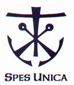
Here is the "logo" that had the most influence on the new Pilots Athletics secondary logo:



DoubleDipper- Pilot Nation Legend

- Number of posts : 11506
Location : Flying, Golfing, or at the Game
Registration date : 2011-11-03
 Re: Nike news
I got an email about the reveal at the soccer game on the 24th, which will also apparently include new colors. All I can say is it better not be the gold debacle again, because if there's one thing I don't want it's to look like Washington.

PurplePrideTrumpet- All-American

- Number of posts : 2880
Age : 43
Location : Section 18A, Row 5
Registration date : 2007-11-24
 Re: Nike news
New colors? I'm guessing black and/or grey. Some of the teams have already been using those, including MBB using black as a highlight on its uniforms. WBB wore black uniforms in the WCC tournament last year. Men's soccer has been wearing purple-and-grey striped uniforms this fall.
Or maybe it will be lime green.
Or maybe it will be lime green.
NoPoNeighbor- Playmaker

- Number of posts : 1405
Registration date : 2012-02-04
 Re: Nike news
This is the email:PurplePrideTrumpet wrote:I got an email about the reveal at the soccer game on the 24th, which will also apparently include new colors.
The University of Portland has extended their contract with Nike through the 2021-2022 school year. Nike has been working on a brand refresh that includes a new secondary logo and new colors, this will be unveiled during the Women's Soccer game versus Pepperdine Friday, October 24th, at 7:00 PM. Join the Pilots as they blackout the stands that night to celebrate the Nike partnership with the university and have a chance to win free giveaway items. Tickets are only $10 for adults, $5 for kids, and there are special group and youth team packages available as well. For more information, visit Portland Pilots.com. For Tickets, please visit the Pilots Box Office or call (503) 943-7525

DoubleDipper- Pilot Nation Legend

- Number of posts : 11506
Location : Flying, Golfing, or at the Game
Registration date : 2011-11-03
 Re: Nike news
NoPoNeighbor wrote:First thoughts on the logo: I don't understand why the wheel isn't complete. Seems like it is overly stylized just for the sake of being stylized.
I understand your point, but I would assume they would have to stylize it enough to make it unique enough to get a trademark on it. If you remember, the old wheel logo could not be trademarked.
I'm just looking forward to more options for shirts, etc... we have been stuck with the limited variations of the same ol' design for years.
_________________
Run 'Em Aground Pilots!

PilotNut- Administrator

- Number of posts : 4259
Age : 51
Location : The 503
Registration date : 2007-04-28
 Re: Nike news
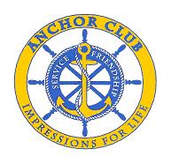
Yeah, with a quick google image search I was able to come up with some complete pilot wheels that might make the trademarking an issue...


All in all it seems fine for a secondary logo, something on the legs of shorts, maybe on the chest of a polo shirt. It isn't revolutionary by any means but it gives more options for apparel and whatnot.


All in all it seems fine for a secondary logo, something on the legs of shorts, maybe on the chest of a polo shirt. It isn't revolutionary by any means but it gives more options for apparel and whatnot.
DaTruRochin- Administrator

- Number of posts : 3576
Location : Boston, MA
Registration date : 2007-05-01
 Re: Nike news
I like it
The only question now is, which logo's do I use for my cornhole set?
The only question now is, which logo's do I use for my cornhole set?
DTLegend- Pilot Nation Regular

- Number of posts : 385
Age : 36
Location : Sacramento
Registration date : 2008-04-16
 Re: Nike news
DTLegend wrote:I like it
The only question now is, which logo's do I use for my cornhole set?
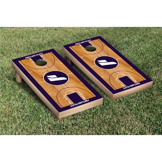
Only $191.39 from =12497963&gclid=CJX72_CfoMECFU1afgodKAwAPw]Wayfair.com.
NoPoNeighbor- Playmaker

- Number of posts : 1405
Registration date : 2012-02-04
 Re: Nike news
More from the Bookstore website... no apparel with the new logo yet, however. I need some time to decide if I like it... I don't hate it though.


_________________
Run 'Em Aground Pilots!

PilotNut- Administrator

- Number of posts : 4259
Age : 51
Location : The 503
Registration date : 2007-04-28
 Re: Nike news
http://uportland.bncollege.com/webapp/wcs/stores/servlet/Nike_Classic_Hoodie/ProductDisplay?parentCatId=&imageId=890649&level=&graphicId=P004520PTUN06P&categoryId=40360&catalogId=10001&langId=-1&storeId=28051&productId=400000074380&topCatId=40000
I think it looks pretty sharp! Would actually think about getting this if the logo was embroidered as opposed to screen printed.
I think it looks pretty sharp! Would actually think about getting this if the logo was embroidered as opposed to screen printed.
Guest- Guest
 Re: Nike news
LOVE IT! Can't wait to see what apparel they turn out with this!

pilotram- Playmaker

- Number of posts : 1136
Location : Seattle, WA
Registration date : 2009-02-03
 Re: Nike news
"People had a strong affinity for the old anchor and wheel mark:
Official release and longer video here:http://portlandpilots.com/news/2014/10/17/GEN_1017142052.aspx?utm_source=Fire%20Engine%20RED&utm_medium=email&utm_campaign=Rebranding%20NAB
Official release and longer video here:http://portlandpilots.com/news/2014/10/17/GEN_1017142052.aspx?utm_source=Fire%20Engine%20RED&utm_medium=email&utm_campaign=Rebranding%20NAB

DoubleDipper- Pilot Nation Legend

- Number of posts : 11506
Location : Flying, Golfing, or at the Game
Registration date : 2011-11-03
 Re: Nike news
I will frame this comment in saying that I have not yet been into the bookstore, I have only been looking at their website apparel options.
I am already disappointed in this brand roll out, from an apparel standpoint. A major complaint of mine previously was the lack of variety/options in the use of the logos/texts (almost everything was just the small P logo on the chest, or the larger centered stacked Portland Pilots logo... with little to no variation). If you look at the items with the new wheel/anchor logo, it is the same thing. Every single sweatshirt and t-shirt is the exact same thing: the new logo, with the word "Portland" under it. Where is the creativity? The design? The visual interest? Variety? Why would I be interested in buying something in this new design that everyone else has the exact same version of? I certainly wouldn't be inclined to buy more than 1 item, either.
I realize we don't have the connection and demand to Nike to match what UofO has, but check out some of our comparable WCC schools:
Check out the variety SMC has: LINK
USF has nice selections: LINK
Pepperdine has some nice choices: LINK
This is not a new problem... this has been an issue dating back to the old wheel logo--and the P logo was supposed to address it... yet there was little in Nike apparel at any given moment in the bookstore, and even less available in Chiles. The bookstore REALLY needs some competition.
_________________
Run 'Em Aground Pilots!

PilotNut- Administrator

- Number of posts : 4259
Age : 51
Location : The 503
Registration date : 2007-04-28
 Re: Nike news
(Or at least a resident t-shirt enthusiast...)

DaTruRochin- Administrator

- Number of posts : 3576
Location : Boston, MA
Registration date : 2007-05-01
Page 1 of 2 • 1, 2 
 Similar topics
» Pilots Re-Up with Nike
» New Pooh Nike spot...
» Nike tournament
» New Nike uniforms
» Nike Extravaganza Recap - Kris Yanku
» New Pooh Nike spot...
» Nike tournament
» New Nike uniforms
» Nike Extravaganza Recap - Kris Yanku
Page 1 of 2
Permissions in this forum:
You cannot reply to topics in this forum